ANOTHER WAY OF DOING THEATRE
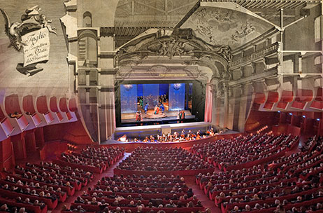
The operatic Theatre of Turin, the Teatro Regio, one of the most large and important in Italy, built in 1740 and included in the serial heritage site of the Savoy residences UNESCO Residenze Sabaude, which has been listed as a Heritage Site since 1977, is to introduce the EasyReading font for subtitling all its performances, starting from the 2018 opera and ballet season.
What are subtitles, though, when referred to a term used for theatre?
To be exact, these are projections of the texts of the theatrical work translated into one or more languages. The operation involves projection during the performance of electronic subtitles on a special screen, or a shown in a space included within the stage scenery. Subtitles were first used in January 1983, in Toronto and first appeared in Europe in 1986 in the Civic Theatre of Florence.
The inclusive font, brainchild of the Turin designer Federico Alfonsetti replaces the Palatino Linotype, so as to make the theatrical show accessible to everyone by improving visibility of the texts, for the benefit of audiences of diverse languages or with hearing impairment, as well as those with dyslexia. In this case, though, a further step forward is taken, by introducing a font that makes things easier not only for those who are dyslexic, but also for all normal readers.
The first work to feature the use of the EasyReading font was “Tristan and Isolde”, a musical drama by Richard Wagner. The subtitles were in two languages, Italian and German, and consisted of 80 pages of text and around 1,200 captions, which underlines the importance of making the texts easy to read and understand.
The Teatro Regio has always paid great attention to communication and scenography of its works and has just signed an annual contract with Easyreading Multimedia S.r.l, as a response to appeals from the theatre-going public, which is transversal inasmuch as it includes a large number of young people, but also a large percentage of older adults in the Third Age category, who will be pleased to hear the news of the use of a font that makes it easier to read the illuminated subtitles, included over the proscenium.
It should be underlined that in the theatre our brain is subject to too many stimuli; watching an opera is actually equivalent to listening to a disc, watching a film ad reading a book all at the same time, so there is clearly a need to aim for maximum legibility as a real innovation.
Federico Alfonsetti cannot fail to be satisfied, following on his collaboration with the Reggia di Venaria (the Palace of the Savoy family just outside Turin) launched last week with the opening of the “Genius and Skill” exhibition, which is also using the font that he designed: «This further element emphasises with more strength how modern-thinking it is, to want to create a new form of communication and, in this case a new form of theatre, which can make use of modern subtitling techniques to complement scenographic representation in its traditional conception and make it accessible to an increasingly wider audience. This is the first theatre to introduce our font and it is an honour, not to mention an immense pleasure, especially as it is the Teatro Regio of Turin, with all the history associated with it, that has chosen us. We are looking at the first example of use of the font in subtitling panels, which aim to be just as easily visible and decipherable from the front rows as from the back rows. We hope this can soon be repeated in other theatres, as well, and not just in Italian ones».
 TEATRO REGIO
Piazza Castello, 215 – 10124 Turin (Italy)
www.teatroregio.torino.it
EASYREADING Multimedia S.r.l.
Via Principi d’Acaja, 7 – 10143 Turin (Italy)
www.easyreading.it