A High Legibility Font: What does it mean?
Each and every one of the over 1,900 EasyReading® characters – letters, numbers, punctuation marks, symbols, in other words all the glyphs – has been individually designed to be really easier to read. This means:
- more recognisable, because we broke the most common font symmetries and cancelled the crowding effect on purpose;
- more spaced, because, thanks to the longer than usual ascending and descending parts of the fonts, the lines in the text appear to be naturally clearly separated.
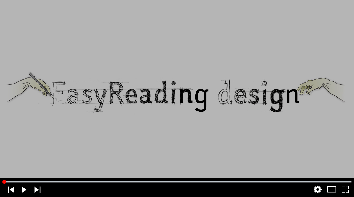
Watch the video below for a deeper insight!
Amazing, but all of this boils down to…?
… to be able to read faster and with less effort compared to the other fonts, with a more accurate acquisition of written text. Small change, would you say? At the end of the day this means you might feel less eye-strained and less exhausted; you might be able to read more in the same amount of time or read the same amount of text more quickly.
And there is more: we built EasyReading® from scratch to be an inclusive device. It means that the same font which can help readers normo provided to read more clearly and easily can, at the same time, be an effective aid for dyslexics. So the big advantage here is that the same text can be proposed, presented, submitted, sold to anybody and anybody can use it.
No difference, no setting aside, no telling apart. That’s it!
Lovely, but should I take it for granted?
We are confident and stay behind what we have said and done, yet somebody challenged us and did not take our word for it. In 2013 Prof. Christina Bachmann, psychologist and psychotherapist, conducted a scientific investigation on about 600 pupils and concluded that “…the EasyReading® font facilitates reading for both normal and dyslexic readers and can rightfully be considered a very effective compensating tool for dyslexia and a facilitating font for all readers.”
You will find reasearch here, translated into several languages.
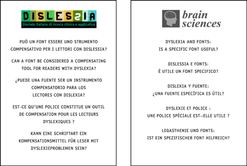
By the way: no other font in the world has been so far scientifically examined, let alone coming out with flying colours. No one, let us state it again: neither among the self-appointed ‘high legibility’ fonts, nor among the so called ‘dyslexia oriented’ fonts.
Alright, it works: But do I really need it?
Just think about it: do we need to wear elegant (oh, yes: EasyReading® has been awarded a prize for its design), yet more comfortable shoes? Shoes that are easier on your feet, that let you walk longer and faster? Could we use a lighter bicycle to fare further and reach our destination quicker? What about an escalator, for those of us who we are impaired?
While you ponder about it, here is where a highly legible font can be put to use:
- books, newspapers, magazines. No brainer here!
- User manuals, drug information, safety warnings. They are of vital importance, and if only they were easier to read…
- Posts, signals, road signs. When you have a split second to realise where you are, or if you should take the next exit.
- Information panels at railway stations and airports, at public offices, hospitals, department stores, museums… To understand, to know your way, to make up your mind. Clearly.
- Visors, dashboards, control panels: To get quickly informed and perform a task without errors. Safe and easy! Who said that a font is only to be printed?
- Desktop and laptop monitors: To create and read documents, to build websites. EasyReading® is by all means a standard TTF (True Type Font) and can be installed much like any other font on Windows, macOS and Unix derived systems.
(What about smartphones and ebook readers? Why not? We might say. But this time it’s up to the manufacturers: would you help us persuade them?).
To wrap it up: EasyReading® is suitable and helpful wherever there is the need or the will to show a text on any support. Well, almost: we are still working on smoke signals. Bear with us!
Very good, I am (still not) persuaded: Can I try it first?
Of course! You can download EasyReading® here, free for personal, non commercial use.
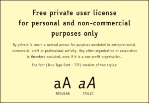
You will get the PRO version, the one recently released. It offers, like we explained before, more than 1,900 characters including letters and symbols from the Latin, Cyrillic, Greek and Copt alphabets. No other high legibility and dyslexia friendly font is so comprehensive. It is our pleasure to donate the complete set of characters in two styles, regular and italic, to end users as a contribution to promote inclusivity.
So download it and get started right away!
If you eventually like it and wish to make it your tool for professional use, we encourage you to get in touch with us. You will need a commercial license and you will get six styles, instead of just two.
You will also discover that a license costs less than a pair of shoes, much less than a bicycle and incomparably less than an escalator!
Thank you for your attention and your patience!
We do hope that you will be curious to try and use our highly legible font by now. We are sure it will find it very useful for you personally and for everybody else, including dyslexics. Including!